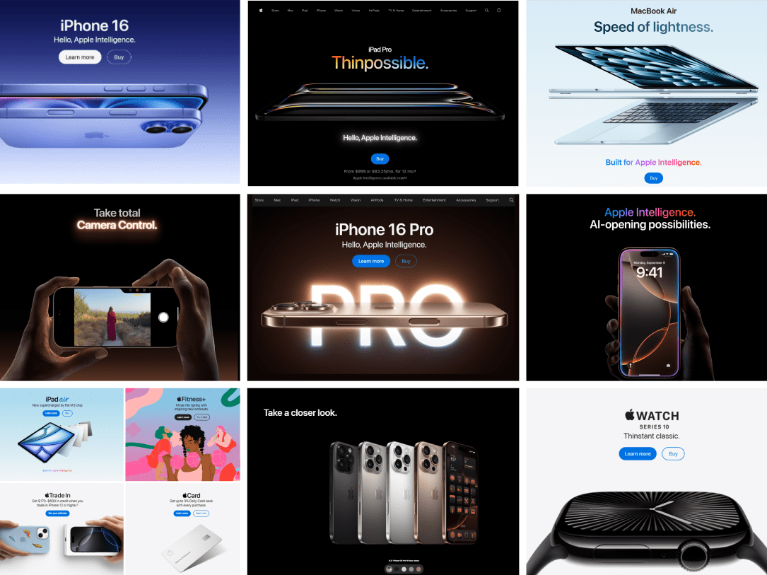

Why Your Website Photography Sucks
Think back to the last website you visited. Did the design of the website leave you with any lasting impression of the brand? Was there anything about the webpage that was memorable -- possibly a headline or image?
If we go by science, chances are what you remember was visual in nature. 90% of the information transmitted to the brain is visual, and visuals are processed 60,000 times faster by the brain than text.
Websites that we identify as beautiful are those that seamlessly integrate all aspects of visual design (illustration, typography, photography etc.) into cohesive brand stories. If one of these areas is neglected, the design can feel unfinished or amateur.
Due to the nature of our craft, web designers have no choice but to be skilled at illustration and typography. We hone these skills on a daily basis. What this means is that of all the aspects of visual design, the one most often neglected tends to be photography.
History of Photography & The Internet
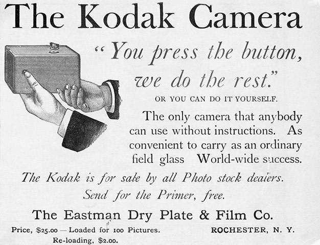
Before we dive into how important photography is to web design, let’s start with a little history lesson. The first box camera was produced by Kodak in 1888. It used film and featured a fixed-focus lens and single shutter speed – truly groundbreaking feats at the time.
100 years later, photography was in the middle of a digital revolution. The technology required to produce commercial-grade digital cameras was becoming more affordable and camera manufacturers realized the massive market potential that existed. Photography, which was once viewed as a skilled trade, was now accessible to the masses – and the masses responded by buying up all the digital cameras the manufacturers could churn out. The barriers to entry that prevented common folk from owning a camera (film costs, darkroom expenses, etc) were all greatly reduced.
In the same decade, we observed the massive popularization of the Internet. People with digital cameras could now share their photos with friends and family members all over the world. The motivations behind owning a camera changed. Digital camera usage grew again.
Now, with smartphones and today’s technological advances, digital cameras have reached a critical mass. More than two-thirds of Americans have smartphones with cameras. The line between professional photographer and amateur photographer is blurred more than ever.
With all the change, it’s easy to understand why many websites end up lacking quality photography. Why hire a professional when you, or your nephew, or your boss’ younger brother owns a camera?
Why High Quality Photography Matters?
Your company’s website is a material extension of your brand. You don’t need a degree in marketing to know the substantial effect that brand perception has on a consumers’ buying habits. If a visitor to your website perceives that you have low quality photography, it’s not unlikely that they do some mental gymnastics and begin to perceive that your company offers a low quality product.
Photography Litmus Test
So how is one to know the difference between good photography and bad photography? Your website may be using crappy photography if you can identify any of the following characteristics:
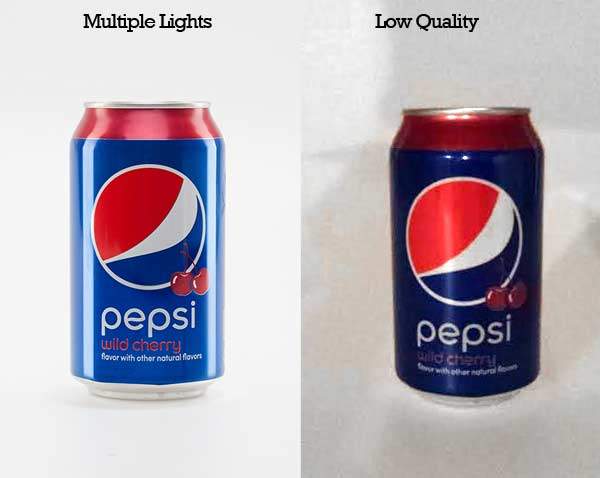
Low Resolution or Low Quality
While your smartphone may take decent enough photos for your vacation photo album, a business website featuring cell phone photography screams “low quality.” If technology continues at the current pace, this may not be true 5 years from now, but as of today, there is still no comparison between the quality of a professional camera and a smartphone. When you combine a higher quality camera with higher quality photography, the difference is night and day.
Overused Stock Photography
Stock photography is often a great alternative to commissioning a professional photographer, however businesses should be very selective of the photography they use. Smaller industries may have a difficult time finding stock photography that hasn't also been used by their competition. Common photography themes (customer service, for example) often have images that are used much too frequently. Is this woman really employed as a customer service rep at 2400+ places?


Pop-Up Flash
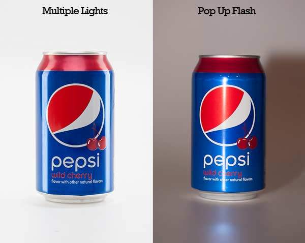
When it comes to product photography, there is nothing worse than to use the direct flash on your camera. Direct flash photography is easily identifiable from a couple tell-tale unflattering features.
- Harsh Shadow
- Harsh Reflection
Compare this to photography taken with several independent lights and you can see why professionals opt for the latter.
Unprofessional Background
It may seem basic, but you’d be surprised how much the background of a product image says about the actual product. If the intention is for the image to be shot on white, it is important that you make sure the background is completely white. Gradients should be smooth with no artifacting. Props or additional set design should be performed with utmost care to your brand.
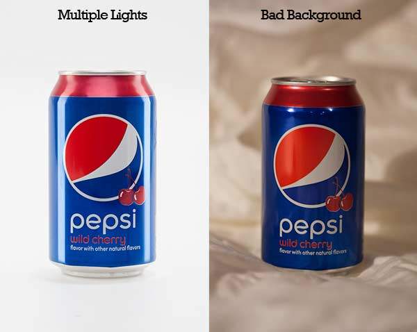
Context, color and set design also play a significant part in the quality of a background for product photography. While what we see most often are products photographed on a white background, professional photographers and stylists work together to create background sets that fit the brand of your product.
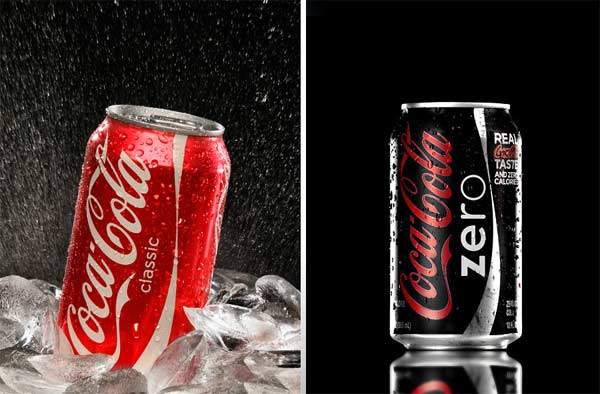
So how did your website photography score? Are there areas that you now see where your photography could be improved? As with so many things in life, you often get what you pay for. If you consider your website an important marketing channel, choose photography (and photographers) that can make your website a worthwhile investment.
