
Web Design Trends to Watch
Trends in website design change quickly in our current digital age, as the world's relationship with the internet continues to evolve and deepen. Strategically designing websites with creativity and ingenuity can influence positive business outcomes, so staying on top of emerging web design trends is often a top business goal.
As we move into 2022, keeping pace with the latest developments in web design can give your overall digital marketing strategy the highest chances of success when it comes to attracting organic traffic and generating leads, brand awareness, or sales on your website.
The challenge for businesses is designing websites that keep up with the latest trends while also maintaining best practices for search performance. Search engines like Google now emphasize your website's page speed and other technical factors when factoring search rankings, so balancing sleek web designs with a user experience that appeals to your visitors is key.
Let’s review some of the latest trends for business website design that are emerging in 2022.
Movement Toward Minimalism
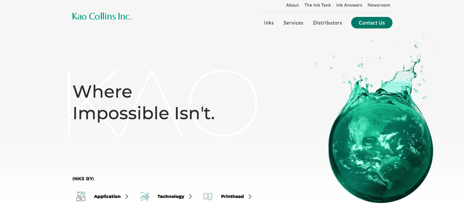
The homepage of the Kao Collins website that features a simple, minimalist design.
One design trend sweeping the United States is minimalism, and websites are no exception–the practice of a flat design and including only what is absolutely crucial to the website and end-user emphasizes details that we value the most and removes distractions from the web experience.
Minimalist websites make it easier for web designers to incorporate responsive design, which creates a better viewing experience on varying device screen sizes. Minimalism also makes a website easy to navigate.
There are page experience and performance benefits for using minimal design as well, which matters for SEO as much as user experience. With fewer objects on the page, minimalist websites load faster.
Minimal design also allows users to concentrate all their attention on your messaging and what you sell, rather than being distracted by design elements, which means they stay on your website longer and bounce less often.
Accessibility Gaining Traction
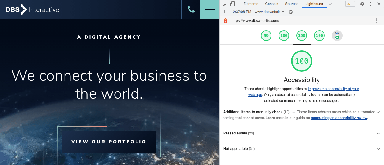
DBS Interactive has a website that that adheres to accessibility standards and best practices
Web accessibility addresses the needs of every website visitor to achieve an optimal level of usability and ADA compliance. That’s not all–in addition to making websites more inclusive, accessible websites perform better in search and typically improve the user experience for all audiences.
Having an accessible website also protects businesses from the threat of legal action for noncompliance. In 2021, there was a 15% increase in the number of website accessibility lawsuits filed against businesses with non-compliant, inaccessible websites. These numbers will continue to rise as governments throughout the world adopt digital accessibility laws to prevent excluding a large portion of the population from accessing vital services and information.
Despite the advantages of accessible websites, recent studies have shown that less than 3% of the world’s top 1 million websites pass a basic accessibility audit. There are many factors driving this, including the fact that few web designers know how to design ADA compliant websites. Accessibility has also often been largely ignored as a fundamental tenet of website development, though this is changing as awareness grows in the developer community.
The growing awareness of accessibility, the risks carried with inaccessible websites, and the proliferation of companies (like DBS) that offer web accessibility services at reasonable costs mean the trend of web accessibility will continue to gain momentum throughout 2022.
More background animation and video clips
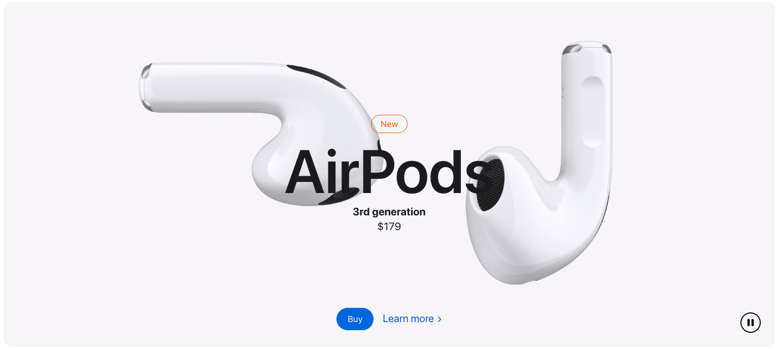
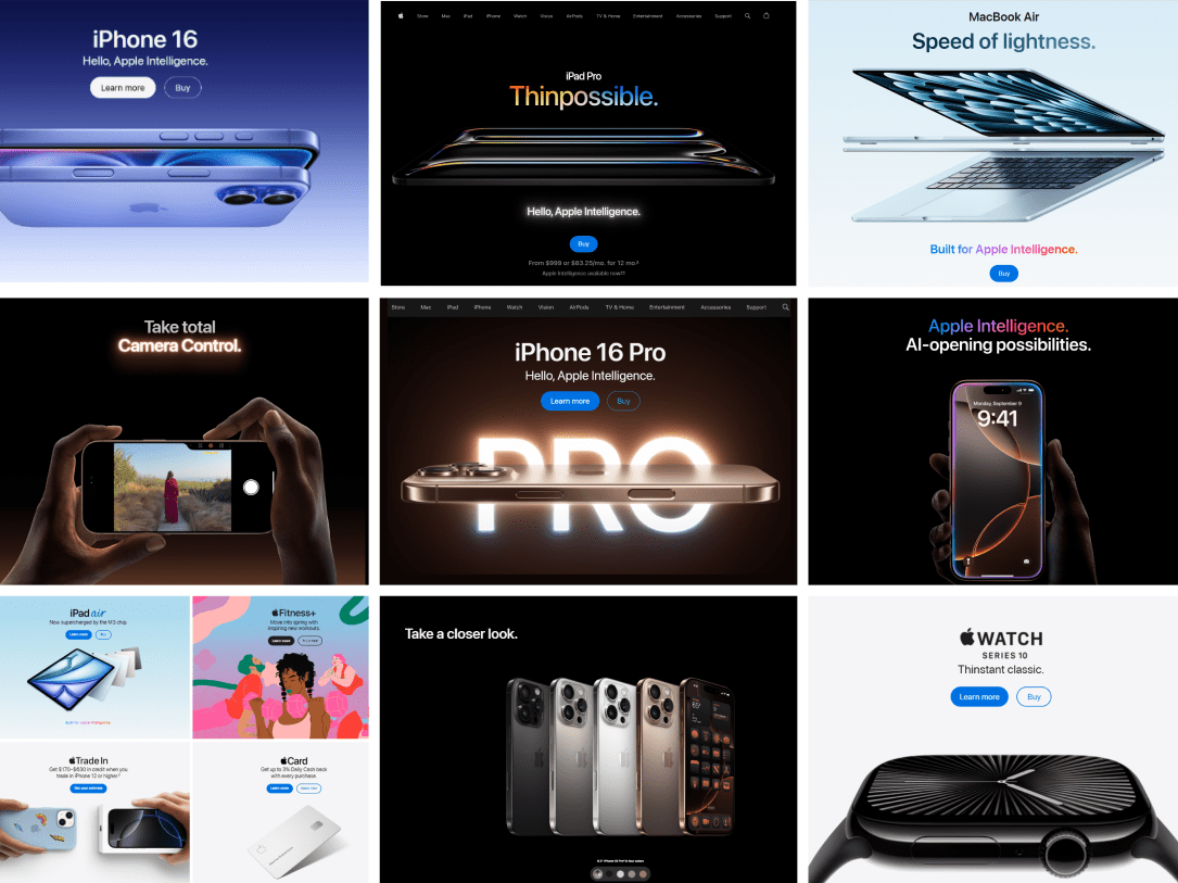
Apple has great background animation that draws the user's attention
Modern businesses understand how visual content makes a huge impact on how people perceive products and brand messaging. Adding movement to the background of a website’s “first fold” of screen space can help keep visitors engaged and motivate them to further explore the website.
Making a short video, gif, or animation will often lower a website’s bounce rates as it captures the curiosity of visitors and entices them to scroll and explore. Users remember 80% of what they see versus 20% of what they read, so effective animation or motion in combination with smart messaging often saves time in communicating information to website visitors.
Creative Scrolling Experiences
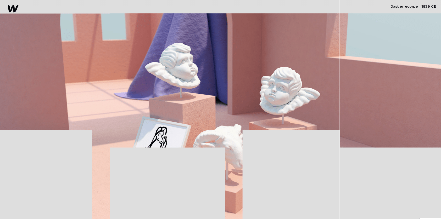
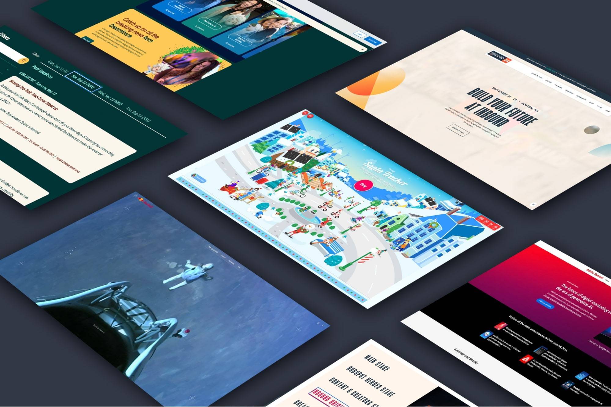
Webflow uses creative scrolling experiences to show off what their products can do
Scrolling is a common KPI for digital marketers because scroll depth is indicative of how well a web page captures and holds the attention of the user. Creative scrolling experiences can increase how much of the page your target user ends up viewing, which is crucial if your business or brand depends on the user engaging with your content and converting on the website through sales, subscriptions, or lead generation.
Parallax scrolling is nothing new, a special scrolling technique used in web design where background images throughout a web page move slower than foreground images, creating an illusion of depth on a two-dimensional site. While parallax effects were more gimmicky in the early days, websites like Webflow have embraced the parallax effect on product pages of their website, evidencing this web design method has found renewed interest among designers and developers.
Deploying new and creative uses of the scrolling effect that don’t negatively impact the website's user experience could help differentiate brands in competitive markets as web design best practices become more standardized and adopted across the digital landscape.
Design that Prioritizes Speed
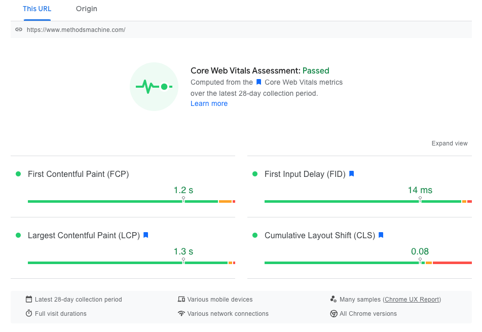
When Methods Machine Tools' website is put through a tool like PageSpeed Insights it passes the Core Web Vitals assessment
With Google’s introduction of the Page Experience update in 2021, page speed and download time have now become two of the most important factors for websites to earn the highest possible ranking in Google Search.
Creating a design that is mindful of these two search ranking factors will help avoid limiting the search performance of a website due to a great but heavy graphic that ruins your site’s ability to compete with faster sites in the SERPs.
While Google’s own performance thresholds are established in its new Core Web Vitals, there are some general web design best practices that help websites achieve the fastest possible user experience. The ideal website load time for mobile sites is 1-2 seconds. 53% of mobile site visits are abandoned if pages take longer than 3 seconds to load. A 2-second delay in load time can result in bounce rates of up to 87%.
Every second will still count in 2022 as people like fast sites. So does Google. In fact, Google likes blistering fast sites so much it has moved to what it is calling a "mobile-first" index.
WebVR Experiences
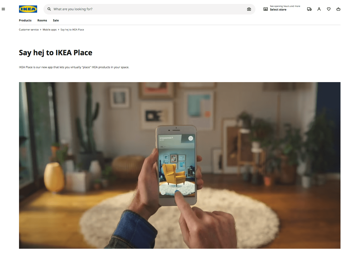
Ikea has innovated the furnishing industry with an augmented reality feature on their app that allows the user to see Ikea furniture in a room with only the use of a mobile device
Websites like IKEA and Zillow have embraced VR (virtual reality) and give their users a tool that allows them to better envision how the product would look in real life, before even seeing it in person. Products like Adobe Aero make this much simpler for users with no experience.
VR used to be the exclusive playground of companies that build the hardware necessary to experience VR, such as Oculus. That has changed with the introduction and evolution of web-based virtual reality, or “WebVR.” WebVR provides a virtual reality experience within a web browser, with or without the need for special equipment, goggles, headgear or anything to download.
WebVR means that once a user lands on your website, they are instantly ready to experience any virtual reality world you have created for them. This trend is picking up steam as VR enables higher emotional engagement, and can be leveraged to help users in making purchase decisions.
Heavy Text Heroes
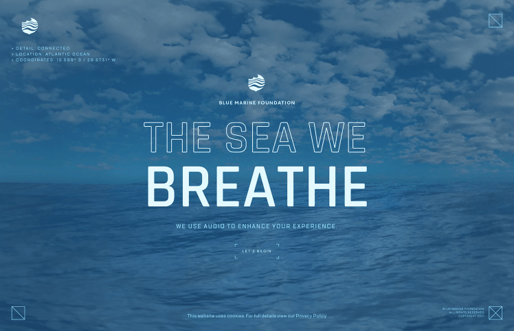
The Blue Marine Foundation uses heavy text heroes to communicate few words in an eye-catching manner
Newspapers always put their most eye-catching, important headline “above the fold” to increase sales. The website equivalent of this is what many of us see at the top of a web page as soon as we land on it, often labeled the “hero section.”
In the past, websites tried to take this a step further and use the advantage of being a digital medium to offer visually striking designs and movement in the hero, rather than focusing on words and typography. But as the web has matured, these visually rich hero sections have become almost commonplace, and in many cases distracting rather than helpful for the end user.
That’s why modern web design is trending more towards catching the attention of internet users who are bombarded by different web pages every day by removing the typical background graphics in the hero section and replacing them with eye-catching typography. A bold, unique font could be just the thing to get a user’s attention quickly and feature the most important messaging of your website.
Moving into 2022 look for images to take a back seat, quite literally, to large typography. This trend is less about the image and more about bold, well-designed typography that pulls the user in and makes them want to read more beyond the headline statement.
Capitalize on the Latest Web Design Trends
Web design experts like DBS help navigate through the complex waters of web design and keep you at pace with the changing trends.
Contact us to see how our team can design and develop a site that incorporates the latest website design principles to drive business success and lead generation.
Frequently Asked Questions
-
- Minimalism
- Accessibility
- Background animation & video
- Creative scrolling experiences
- Prioritizing speed
- WebVR
- Heavy text heroes
