
6 Great Manufacturing Website Design Examples
We select the best examples of manufacturing websites, along with best practices for designing industrial websites that achieve marketing goals for manufacturers.
Before the internet became part of daily life, manufacturers generated new business by focusing their marketing resources on traditional channels such as trade shows, industry conferences, and digital or print advertisements in business publications.
In those days, company websites were an afterthought at best, viewed by many manufacturers as nothing more than digital brochures that proved the company's existence. Today, of course, we know manufacturing websites can be powerful tools for generating leads, brand awareness, and business growth.
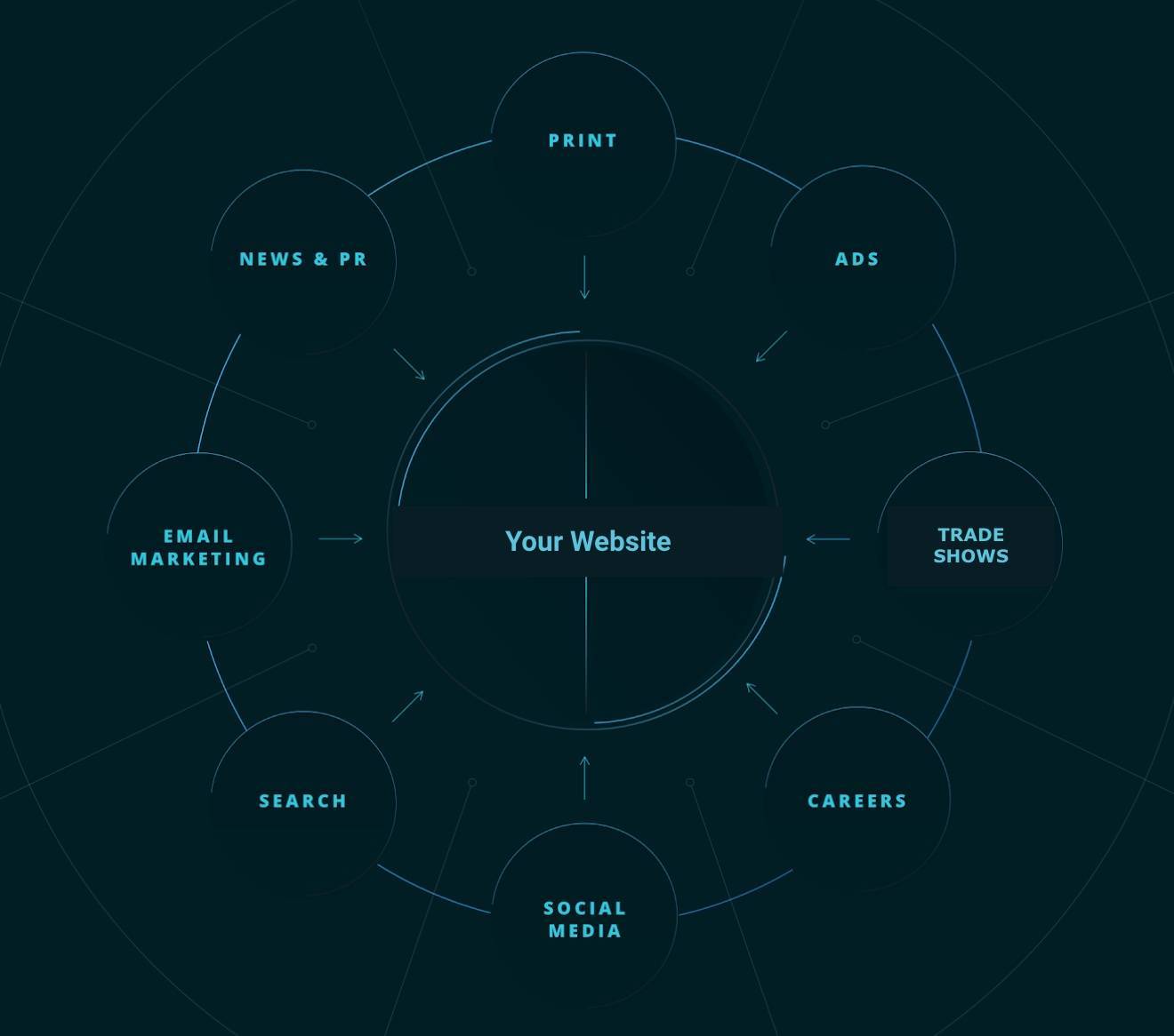
In fact, research shows that even when a business is not selling its products directly online (as is the case for most manufacturers), the website is the most effective conversion point on the B2B marketing funnel.
That's because no matter where audiences discover and interact with a manufacturer, the website plays an important role in shaping consumer perspectives about the brand, quality, and customer service.
That makes the design of a manufacturing website critical to driving business growth and success by capturing prospects arriving from multiple marketing channels, while simultaneously providing adequate support to existing customers.
To help you make your manufacturing website designs more effective, here are six important best practices for designing manufacturing websites, along with helpful examples of manufacturers that put these best practices to work on their own websites.
The Top 6 Manufacturing Websites
Click below to jump to any featured example of web design best practices:
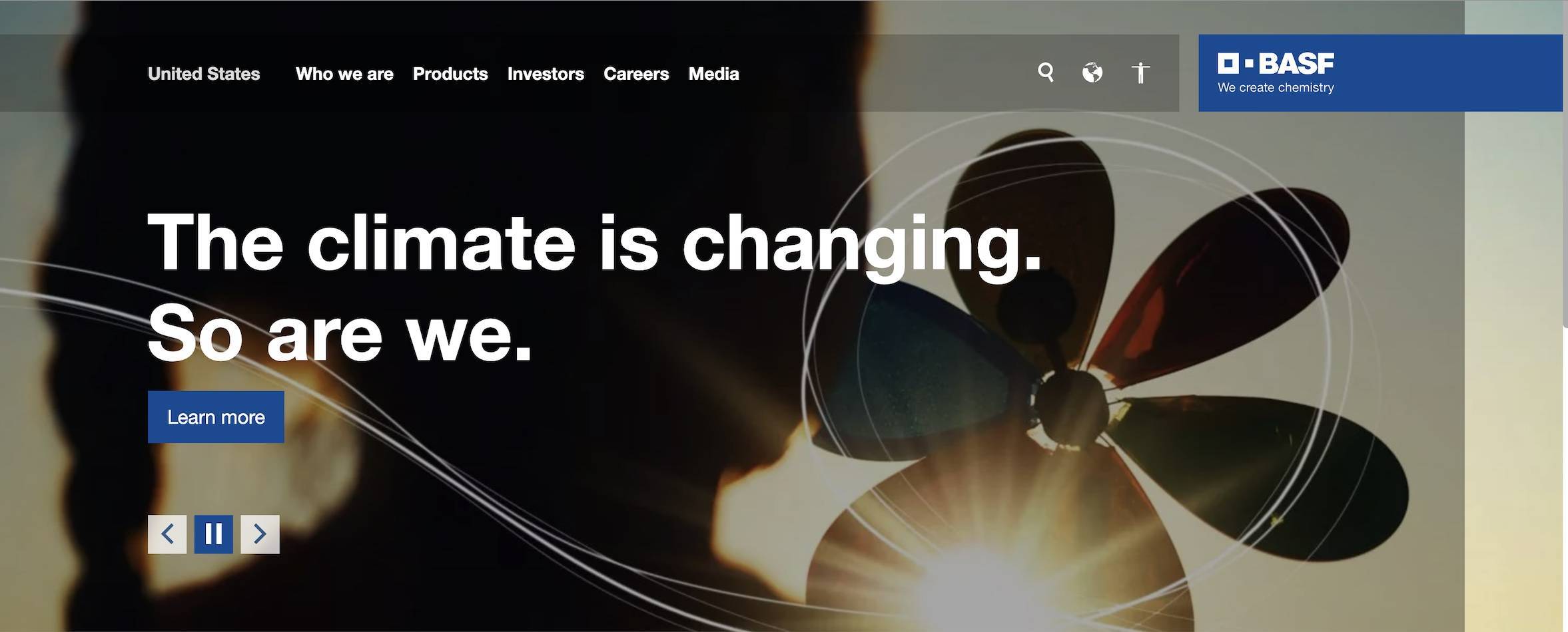
The BASF website's main navigation menu is seen clearly at the top of the page and only includes a few options, reducing the "paradox of choice" for new visitors.
Few experiences online are as frustrating as a website that is hard to navigate. That's why simple, intuitive navigation is a must for manufacturing websites.
Global manufacturer BASF uses a mega-menu navigation feature to effectively simplify navigating a large website with a lot of content. Visitors access the menu by clicking one of the five navigation options listed at the top of their homepage.
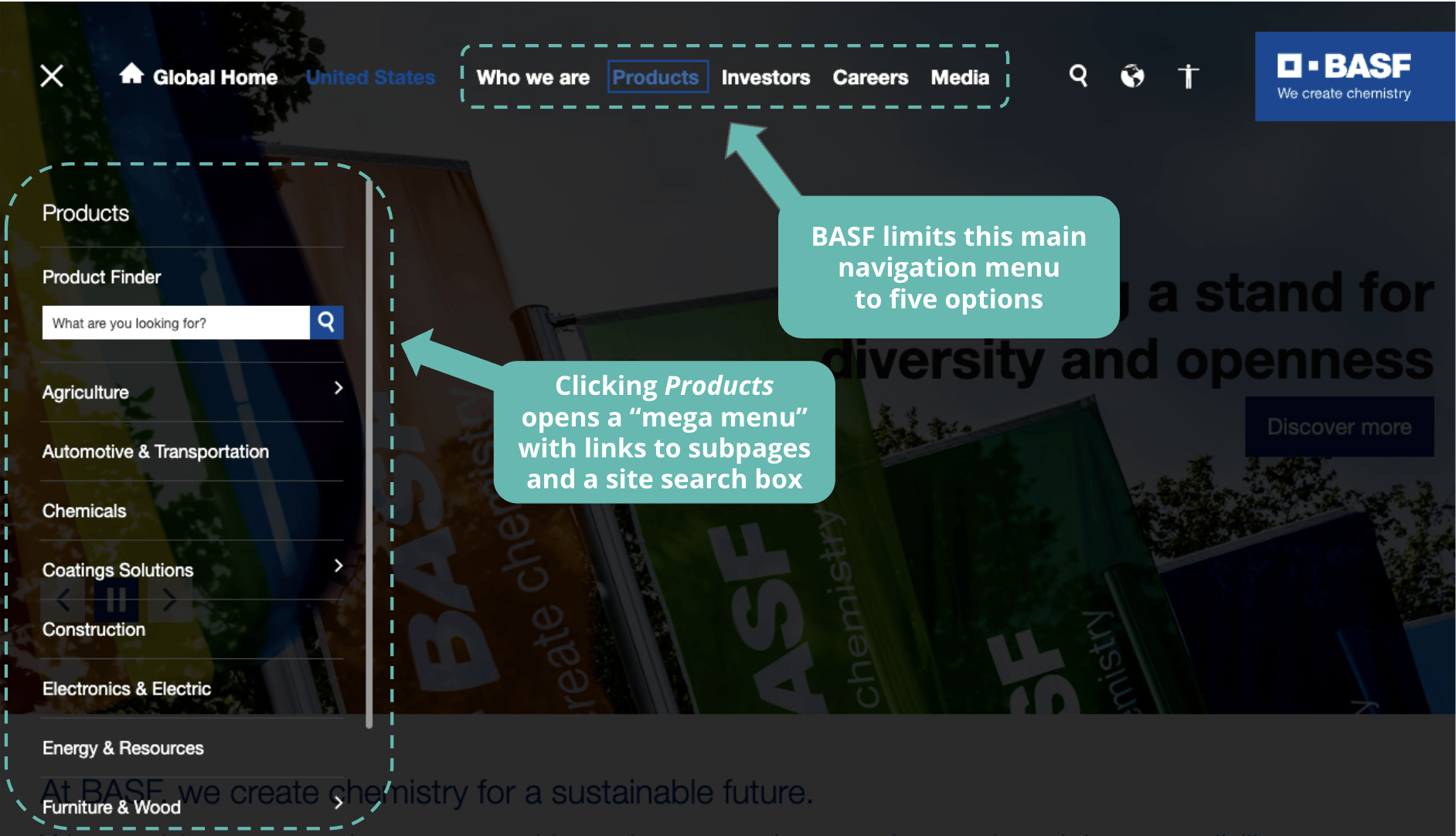
Clicking a main navigation menu item opens a "mega menu" with sub-menus; the sub-menu for Products even features a site search box.
By helping their users find and click through to the pages and content they need with this main navigation menu, BASF did a fantastic job of improving user experience. And this approach to navigation is particularly useful for BASF because the company is a large and global manufacturing business that offers everything from chemicals and materials to industrial, nutritional, and agricultural solutions, all supporting a wide variety of industrial sectors.
That means the website must serve a vast audience of visitors who have different needs, interests, and priorities, which makes it more challenging to design navigation that supports all of them.
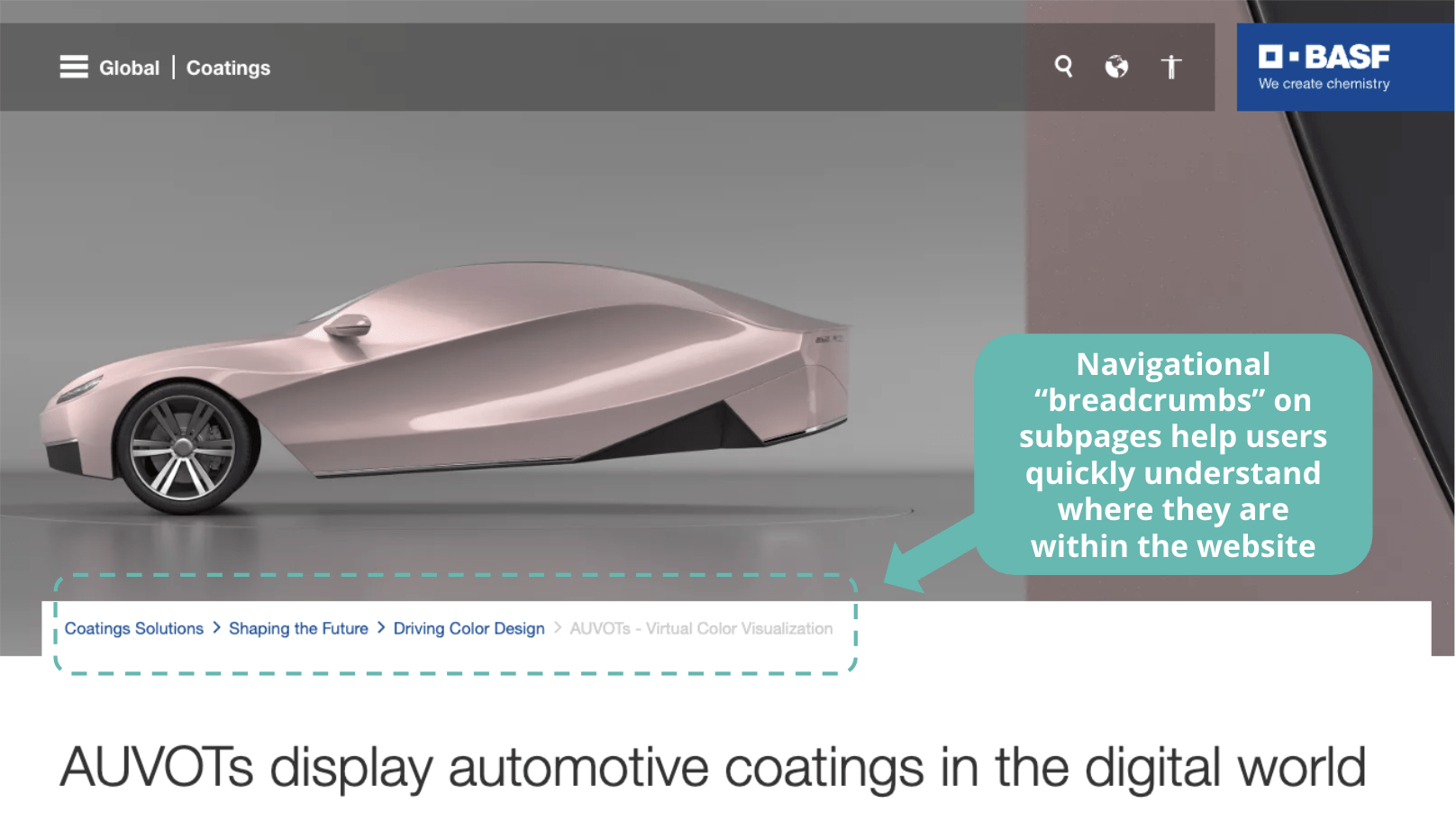
Interior pages of the BASF website feature navigational breadcrumbs that users can click to view similar or related pages.
In addition to the main navigation menu, BASF's interior pages include clickable breadcrumbs just below the hero image that give the user an immediate understanding of where they are within the site's hierarchy of pages. Users can also click these breadcrumb links to view content they might be seeking on related pages in that section of the website.
View Our Portfolio
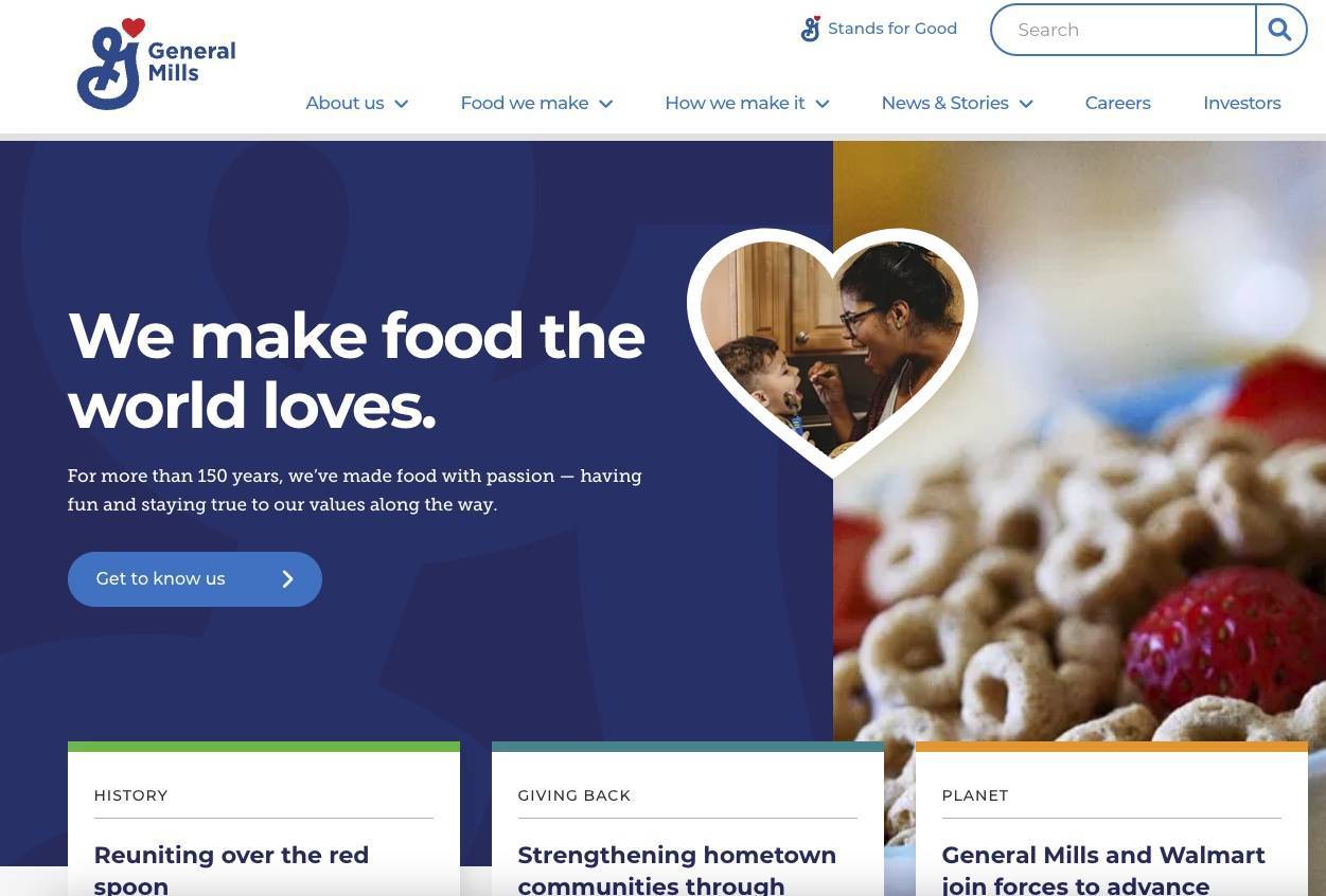
General Mills makes good use of CTAs (calls-to-action) throughout its website, starting with only one CTA in the top fold of the homepage, labeled "Get to know us".
For manufacturing companies, your website should be a place that helps visitors engage with your business. The best way to do this is to include clear next steps for achieving their goals through effective calls-to-action (CTAs).
General Mills' website drives visitors to different content on the site using engaging calls-to-action that appeal to specific user personas and intentions.
Notice each CTA begins with action-oriented verbs, such as Explore, Build, Start, See, and Learn. This kind of descriptive link text helps entice more users to click through by making them feel like they will achieve something and progress toward their goals.
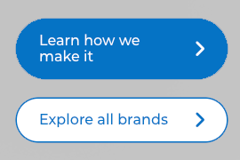
CTAs on the General Mills site are specific, avoiding unhelpful generic copy like "Learn More"
As a consumer brand, General Mills aims to make it simple to know more about the company and find products with calls to action featuring friendly messaging such as “Get to know us,” “Explore all brands,” or “Learn how we make it”. The carefully placed CTA buttons or links don’t overdo it.
For many B2B manufacturers, the main CTA involves a lead generation form, because they assume many of the site’s visitors are there to connect with someone in sales or support. For those manufacturing websites, calls-to-action should be designed to stand out prominently so users on any page can find them quickly and easily.
Get Started
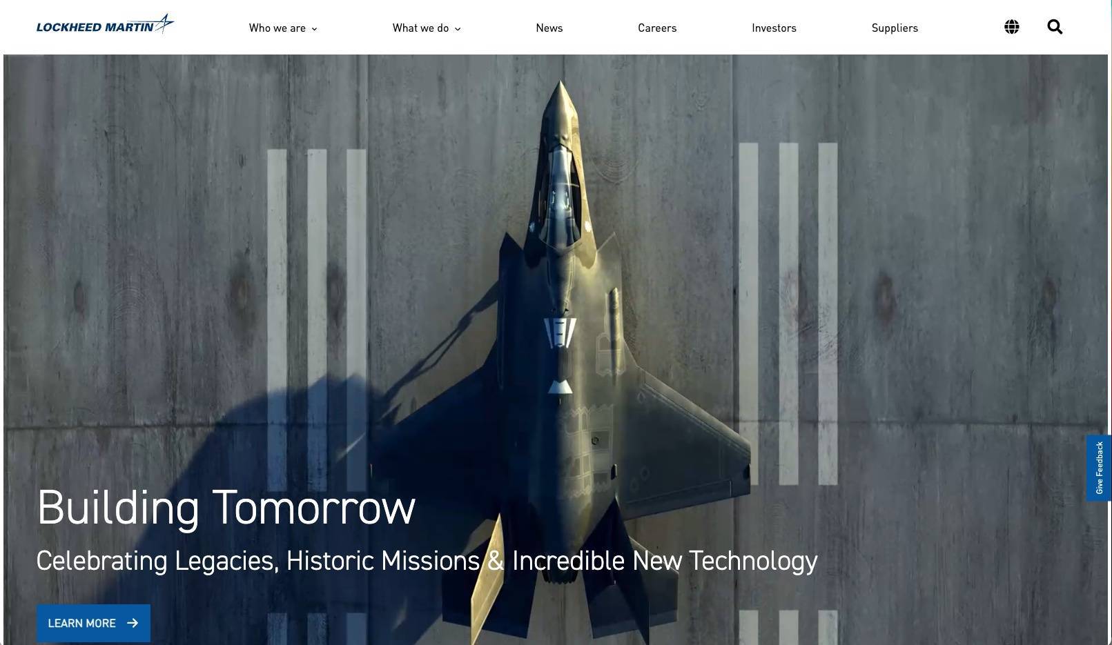
Lockheed Martin's homepage prominently features high-resolution images and video.
Many manufacturing websites are still relatively outdated, and their imagery can be even more so. A high-quality image, photo, video or graphic that tells your visitor exactly what your company does is critical. Moreover, quality images can also differentiate a manufacturing brand from a sea of inferior competitors in their market.
Lockheed Martin's high-resolution photography and videography on its homepage is a great example of good website imagery. For visitors, the images demonstrate the sophisticated technology their company is responsible for. The modern, exciting feel of the imagery also reinforces Lockheed Martin’s brand positioning as a state-of-the-art aerospace manufacturer.
An important best practice to follow with images is to compress large image files, because large media files add to page weight, which slows the page-loading process. Since page speeds are now an important factor of Google Search rankings, having high quality images that don't slow down your pages will be important for maintaining the website's SEO.
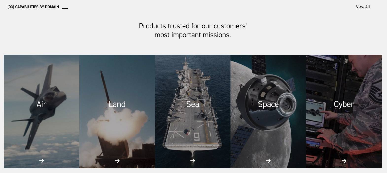
High quality website imagery can also be used for intuitive navigational links, as Lockheed Martin does here to direct visitors to dedicated pages for specific markets or industries.
For manufacturing companies operating within broad industries or long and complex supply chains, high quality product imagery clarifies to visitors the exact devices, pieces, or materials that your company manufactures within that ecosystem. Images can even be used as clickable links that help visitors navigate the site, increasing its engagement metrics, conversion rates, and lead generation.
Let's Talk
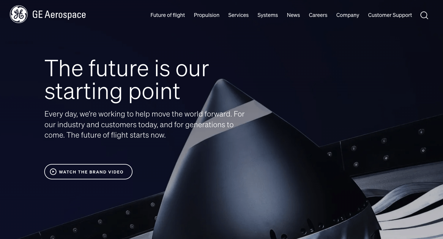
GE Aerospace's hero messaging emphasizes innovation, which reflects their brand mission.
For many visitors to a website, their first few seconds will determine whether or not they will convert into a lead. Your home page hero message generally represents the most-seen area of your entire website, so it's critical that your hero quickly and clearly informs the viewer exactly what it is your company does, and the value it provides.
GE's Aerospace website does a great job of presenting their value statement in five words: “The future is our starting point.” The message instantly communicates that GE Aerospace is a forward-thinking, innovative company pushing the boundaries of what is possible in aerospace manufacturing.
In addition to quickly informing the user of their corporate purpose, GE Aerospace's hero includes imagery that loads quickly, even when browsing the page on a slow internet connection. Since page experience is now a major ranking signal for Google SEO, a fast loading site is necessary for manufacturing websites like GE's to attract the most possible organic search traffic and generate leads.
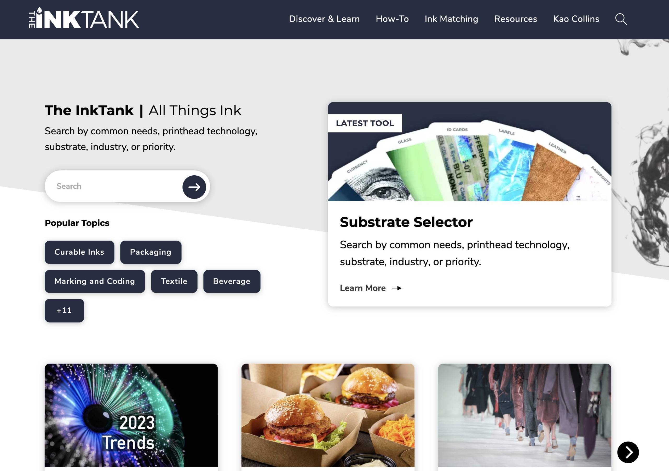
Kao Collins' website features The Ink Tank, a content hub with interactive tools, industry-focused articles, and more.
The most effective content marketing for a B2B manufacturing business happens on the company website, where it serves the dual purpose of supporting online search performance and lead generation while also providing a public-facing digital resource that organizes the brand's thought leadership and industry knowledge.
Through its Ink Tank blog, Kao Collins effectively delivers content marketing to their website audience by utilizing the company's extensive knowledge and reputation within the ink manufacturing industry to offer quality content and thought leadership on industrial printing.
While content marketing pieces published on the Ink Tank support Kao Collins's inbound marketing strategies by attracting new visitors to the company website, they also serve as value-adds for visitors who enter the site via social media, referral links, or other channels.
Linking to the blog's most relevant and informative content from the company website's primary landing pages helps all visitors become more informed and engaged, increasing the likelihood of new visitors generating leads.
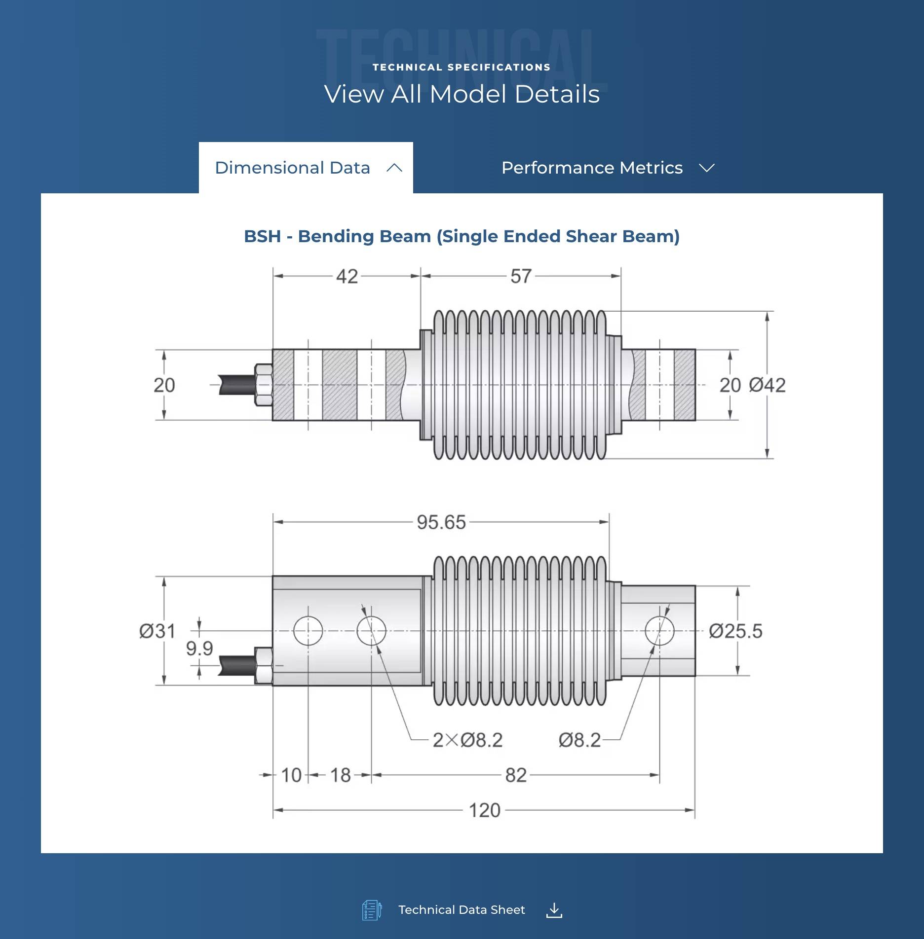
Transcell website's product pages include technical specifications and illustrations.
In manufacturing, website designers are often challenged with creating an enjoyable user experience for a diverse and highly technical audience of website visitors, such as engineers and production managers. These audiences have sophisticated needs, so when your website design makes it easier for them to access and view important product specifications or technical data, these users will appreciate that as much as (if not more than) all the great visuals and messaging on your site.
For a manufacturer of load cells and force transducers for custom-engineered weighing solutions, Transcell's website maintains great visual aesthetics while also using smart web design to present highly technical information related to their products and applications. Clean, high-resolution schematics highlight the product's dimensional data, while other tabs provide more details and technical specifications, as well as performance metrics.
This kind of product information is beneficial and useful to the company's primary audience of engineers, who use the information to understand quickly whether Transcell's products will meet their needs before contacting Transcell to start a sales discussion.
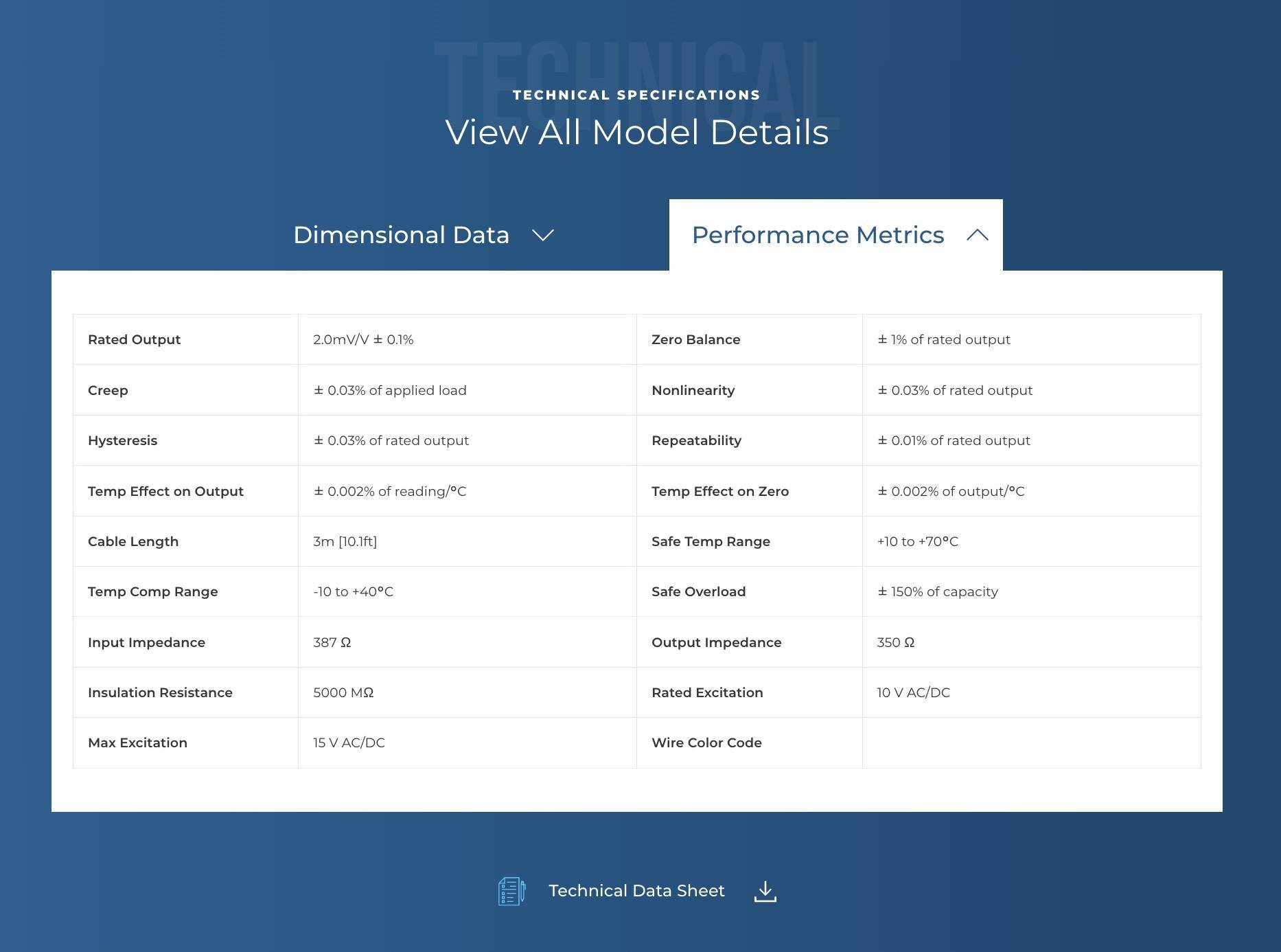
Transcell's visitors can also click the tab to view metrics in a table format.
Navigating the product information is easy for the website's target audience of engineers, product managers, product designers, and others who all need different but equally complex pieces of information about how the technology works, its specifications, requirements, and more.
Simply clicking the drop downs reveals technical specifications and performance metrics that can be easily viewed and tucked away by another click. There is also an option to download technical data sheets, which are helpful for website visitors in highly technical industries who need offline access to product information.
Your Manufacturing Web Design Agency
There's something to be said for proven expertise–and when it comes to designing websites and marketing for manufacturers, we're proud of our proven reputation for delivering measurable business results.
Here at DBS, we have over 25 years of experience designing and developing high-performance manufacturing websites for world-class brands, including Methods Machine Tools, Kao Collins, and Big Ass Fans.
We offer a free website audit and customized quote for your website redesign project. The sooner we launch your new site, the sooner it can generate more leads and traffic for your manufacturing business.
Request Website Audit & Consultation
FAQs
Yes, now more than ever manufacturers are positioned to generate leads online with a well-designed and technically optimized website, because that will improve their chances of ranking on the first page of Google and other search engines that attract and funnel prospective customers.
A good call-to-action (CTA) is more than just choosing the right words; the perfect CTA includes succinct messaging focused on what the visitor is looking for, placed strategically on a webpage in an easily discoverable area surrounded by elements that direct the user’s attention towards it, all designed to compel the user to take an action (on websites, the action is typically a click that opens a new page or feature). In manufacturing, it's important your CTAs use correct terminology and verbiage that's recognizable by your target audience of industrial website visitors.
Historically, websites for manufacturers and industrial companies largely served as online brochures that provided basic information about products and services offered by the business, as well as the locations and market sectors they serve. Over time, well designed and technically optimized manufacturing websites supported by strategic content marketing have become more powerful digital tools for increasing lead generation, customer satisfaction, and brand awareness–three critical components of any manufacturer marketing strategy.

