
How to Boost Your Site's Conversion Rate
Few things in the digital world are more frustrating than having a website that struggles to drive conversions. Solving this problem can certainly seem daunting when you have an entire site at your disposal but don't know what the real issues are. The good news is that there are a number of components you can address to encourage a higher conversion rate on your site. To help you get started, we've outlined six of the most important things you can do when looking to boost conversions.
1. Define Target Audiences
When designing your site or creating new content, it is vital to know exactly who the audience is that you’re trying to reach with your site. Understanding your users and crafting a site that speaks to them requires a significant amount of research and preparation. Proper testing can ensure that you are targeting your audiences correctly, in turn boosting the number of conversions you can expect.
Your content should be tailored to meet the specific needs of your potential customers, so understanding their exact needs is a crucial first step. Specific user personas should be created and all of their needs and desires carefully outlined. If you can define your target audience's needs and map potential user pathways, you stand a much better chance of outlining the value of your product or service. This does wonders promoting goal completions. If you can successfully educate or inform your audience through well-written copy that addresses needs, you should see see a significant increase in site conversions.
2. Address Load Time
We’ve touched on this before, but few things can kill a potential conversion quicker than a page that takes forever to load. Think about the last website you went to that was dreadfully slow. Did it instill confidence in their products or services? A lot of users jump at the first sign of sluggish load times, so be sure to test page speed and make adjustments if needed.
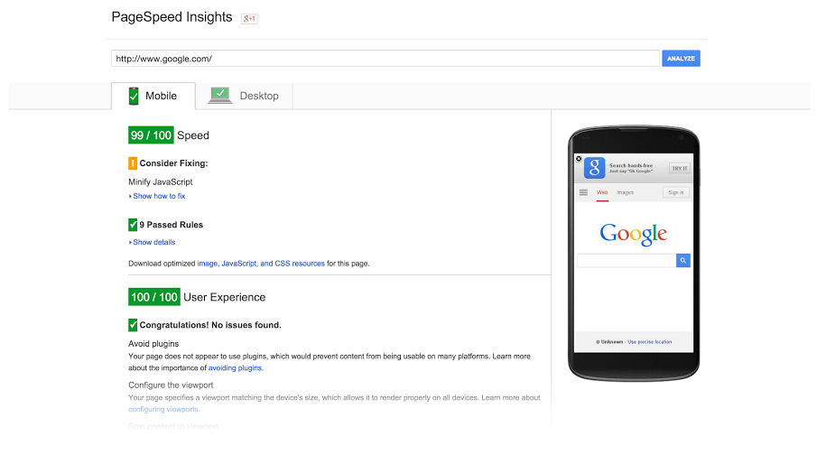
(Source: developers.google.com)
Quick load times can benefit your total conversions in more ways than one. In addition to providing your content to users quicker, faster load times have a positive impact on your Google rank. It’s obviously hard to boost conversions if prospects can’t even find your site, so do what you need to in order to ensure quality page speed. This could be as easy as reducing the number or size of images on a given page.
3. Use Chatbots
Although chatbots are far from perfect, the advancements made since their introduction have them on the verge of widespread adoption. As their capabilities have expanded, so too has their ability to add value to almost any website. With the technology improving everyday, now is a good time to consider adopting this tool and adding it to your site's functionality.
The nice thing about chatbots when it comes to conversions is their ability to move a sale along at any time, day or night. Rather than having to worry about an employee being available 24/7, chatbots and their automated responses can offer help to users and record information from prospective customers even after business hours, encouraging more visitors to eventually complete a purchase or fill out a form.
4. Make Forms Easy to Complete
If completing a form is the end game for your site, you'll want to make sure that your site is designed to drive users to your form or forms. You will also want to make sure that the form is easy to fill out. The last thing you want is for a potential client or customer to get ready to sign up for your product or service only to walk away because of a ineffective form.
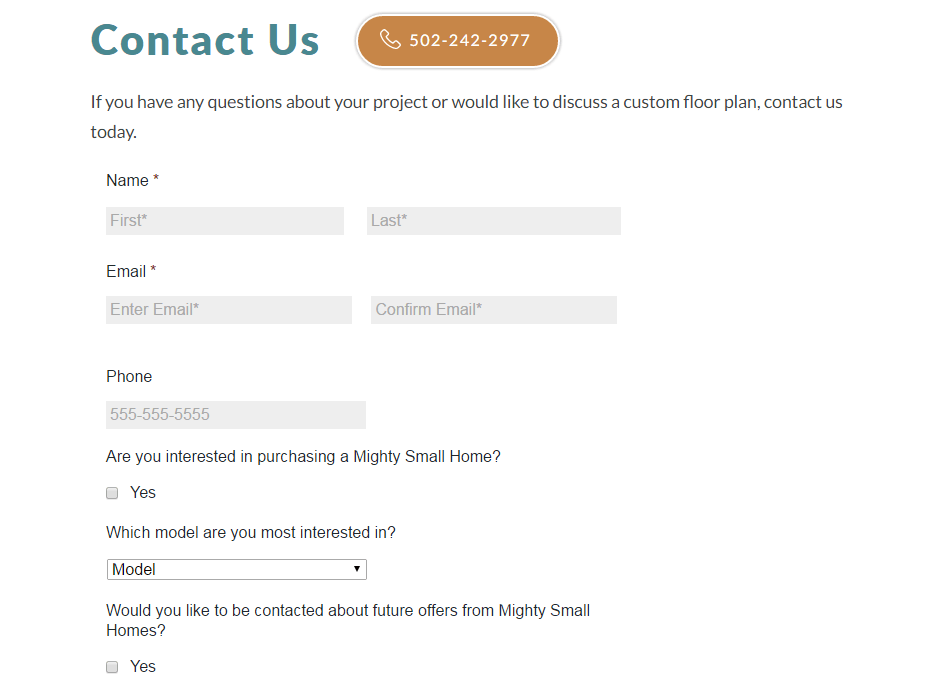
(Source: mightysmallhomes.com)
This is a more common issue than you might think. Plenty of business owners fail to truly scrutinize their forms for usability. To avoid making this error, take the time you reevaluate your current forms and test them in a way that ensures easy use for your visitors.
5. Incorporate Animated CTA Buttons
The best way to encourage visitors to fill out your forms is to incorporate well-placed, well-designed call-to-action buttons throughout your site. This plays a significant role in improving your user experience and can also make your buying process much more effective than your competitors.
In addition to having prime location on your pages, your CTA buttons should be eye-catching. One of the most popular design techniques right now consists of making these buttons animated in some way. A change in color or some subtle shading when scrolling over the button can be more than enough to grab a user's attention and get them to proceed further down the sales funnel.
6. A/B Test Landing Pages
Finally, one of the best ways to determine what is working and what isn't is A/B testing. This is a wonderful way to see if your changes are helping you get conversions and if you're trending in the right direction. We highly recommend you take the time to do this, especially when making significant changes to your landing pages.
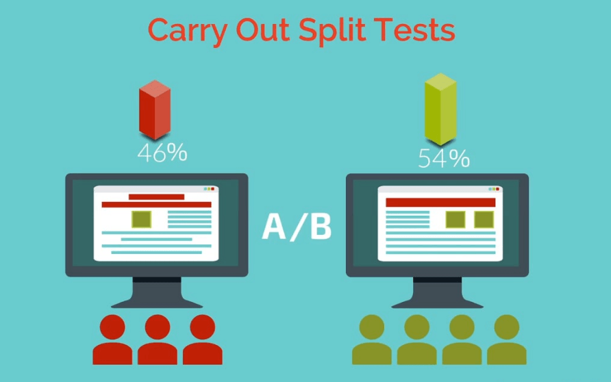
It can be easy to neglect doing something like A/B testing when you're busy running an entire business. Understand that it is more than worth it. The time you set aside for proper testing can lead to double or even triple the conversions you are currently getting. Remember to keep your target audience and personas in mind when doing this and you can expect to see some truly positive results.
If your website success is dependent on conversions, you'll definitely want to consider these six items for your site. Incorporate these into your design and marketing strategies and you'll be sure to see a boost to your conversion rate.
