
What a Ride! Exploring the Holiday World Website Redesign
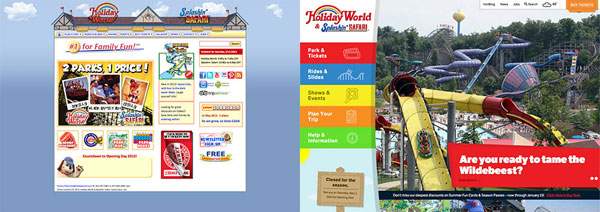
The roller coaster thrill of giving a massive facelift to the Holiday World & Splashin' Safari website is definitely worth the ticket! The world's first theme park has a new website, thanks to the partnership between Holiday World & Splashin' Safari and DBS Interactive. We wanted to combine the sense of fun and excitement of their park with the best online user experience possible.
The Design
We redesigned the website to be mobile-friendly and fully responsive. We utilized a full-width layout with a prominent image slider and vibrant mega-dropdown navigation on the left side of the screen. We made it easy for the website visitor to browse rides and use filters to find the best rides for their tastes. There's a calendar for seeing what shows and special events are planned, and all manner of really useful planning tools to ensure that park visitors get the best day possible!
And all of this is managed through a custom Content Management System (CMS) built on WordPress and made especially for the Holiday World & Splashin' Safari administrators. It's easy to use regardless of an administrator's skill level with HTML.
Being a little bored with box-based layouts, we also created a curved element to define the main navigation. This unusual feature adds something unique to the site. Curves done with images are one thing, but curves purely in CSS and HTML that scale and float within a responsive design, are something else. For this client, we opted for the nicer "something else".
The Responsive Images
One thing that was really important to us was to have good curb appeal with large, high quality images – something that does not always work well for mobile users. In fact, a common hurdle when doing responsive web design is serving images that are appropriately sized for the user's device. Images scale down in size quite well, but not up in size at all. Responsive designs can be stuck using large images -- even for the smallest of devices. The images are scaled down on mobile devices and they will look good, but this takes extra time, memory, and processing power from the device.
With the launch of Holiday World, we integrated a responsive image technique known as "PictureFill". PictureFill approximates the proposed HTML5 picture element using JavaScript. This provides images based on browser window size -- small devices get small images, large devices get, well, large images. The end result is reduced memory, CPU and bandwidth by smaller devices, and a greatly improved user experience because of faster load times, especially for mobile and tablet users. In fact, for the important image situations there are a total of 8 image possibilities for each image (4 image sizes, and 4 retina variations for higher density devices).
The Custom CMS
We take pride in being able to provide our clients with sites that are not just vibrant and exciting to look at, but easy to manage as well. CMS's are a dime a dozen these days, and we don't care to have our clients suffer with those $.10 solutions.
To that end, we always try to make adding and modifying content as easy as possible for site administrators. That means modify the chosen CMS such that the tools for editing the site are tailored to the project at hand. Like snowflakes, no two DBS sites are alike – front end AND back end! Holiday World has specialized CMS features to manage Rides, Image Galleries, Lodgings, Hours of Operation, and Events, not to mention enhanced core features for pages and blog posts.
The Technical Stuff
- Utilizing responsive design the site takes advantage of JavaScript to detect the size of the user's screen to size the main navigation, sidebar, and banner image to any device.
- We made the site more mobile friendly by only loading the max size image necessary to fill the screen space needed and not load the original full size image unless the user had a very large window.
- All the ride information is dynamically tied into the main rides landing page so the user can easily filter and sort by different ride criteria to find what they are looking for.
- There are also a few widgets on desktop displays that show the parks hours and current weather conditions.
The End Result
