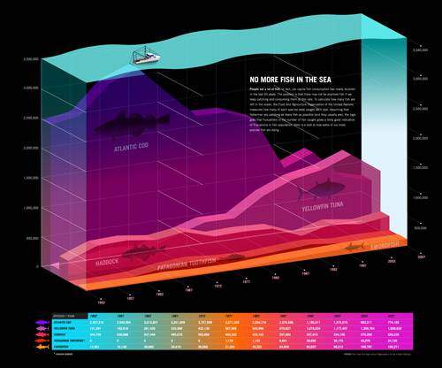
Get The Picture? Using Infographics as Marketing Tools

As the saying goes, “An image tells a thousand words.” No trend literally spells this out more effectively than infographics. They’re used to teach children, college students, and CEOs alike, expressing statistics and knowledge with a graphic representation and making it easy to digest and quick to deliver. Infographics have been all the rage in recent years. They are used to the point where designers will create an infographic about infographics. But what’s the marketing value of using an infographic as a part of your campaign? Links of course.
What is an infographic?
An infographic is an image or graphic that has been created to deliver information in an easily scannable and intriguing format. They can take information that is usually boring and not likely to be read, and they make that information engaging. Whether they are designed to be funny, informative, or to impact you on an emotional level, infographics are popular in any form.
Using Infographics for Internet Marketing
We live in a world with an increasingly short attention span. And that attention span becomes even more condensed when navigating the web. As children, some of us could sit for hours in the yard just staring up at the sky and watching the clouds. Now we hit refresh at least twice if we have to wait fifteen seconds for a webpage to load.
When you only have seconds to grab a viewer’s attention and make a lasting first impression, an infographic is a fantastic choice. They can easily go viral, being shared across social media networks like Facebook, Digg, and Twitter. They are also terrific “Link Bait,” meaning you can use them as a means to ask for links from blogs and other websites.
Infographics work well because studies show that 60% of people are visual learners (I should have used an infographic to show this statistic!). Your average person sits at a desk and reads words on the web all day. Infographics represent a way to capture their attention and leave a lasting impression in a way that no block of text can.
To Make a Long Story Short (Hey! Just Like an Infographic!)
Now, any internet marketer worth their salt knows that images carry far less weight in the search engines than images, so why use an image when you could use text. In this scenario, you’re depending on the viral nature of infographics to balance the scales. Recent estimates are that links and their associated metrics are responsible for around 70% of your position in the search engines. So instead of creating textual content that may receive few links, the hope is that intriguing, visual content will receive many links.
Best Practices for Creating Infographics
So up until this point, I've only told you what an infographic is, however that isn't much help when you are looking to make one for the first time. Luckily for you, I've assembled this list of best practices.
Push Up Your Glasses & Become a Researcher
Infographics are nothing without the statistics that are used to create them. Instead of scouring the web for statistics that already exist, when possible, conduct your own primary research. This will ensure that the information your infographic is conveying is unique to your business and the Internet.
Give Credit Where Credit is Due
If you can’t conduct your own research and instead choose to use secondary research to make your infographic, be sure to credit the sources of your statistics. No one appreciates their hard work not being properly attributed. The modern Internet relies on the basic premise that people will give proper credit to authoritative sources. In fact, it’s the very foundation of Google’s algorithm. If you credit the sources that helped you, than hopefully in return, people will credit your website with a link.
Keep It Simple

The more complicated you try to make an image, the less likely it is to engage the viewer quickly. You want your ideas to come across clear and concise. Too much clutter in an infographic is just noise, don’t let your message get lost in it.
Bullet out chunks of text. Utilize negative space and easy to read fonts. Break up your information in fun or intriguing ways. The goal is to lead your visitor’s eye around the image.
Make It Snazzy with Interactivity
Although not appropriate for every scenario, infographics utilizing animation or video add an interactive element that can be even more engaging. Programs like Flash are capable of producing infographics that function much like a webpage, offering visitors the opportunity to click, expand, or hide elements of your infographic. Video on the other hand is much less interactive than Flash, but can many times be more engaging than textual content. Just take a look at this fairly recent Sprint commercial that uses statistics in a similar fashion as an infographic.
Whether there is interactivity or not, infographics are a tried and true tactic for acquiring links. So what are you waiting for? Start researching some statistics relevant to your industry!


