Flat Design vs. Skeuomorphism

What is Skeuomorphism?
Skeuomorphism is an element of design or structure that serves little or no purpose in the artifact fashioned from the new material but was essential to the object made from the original material. 1
The smartphone presented us with a new medium to do many old things more efficiently and for this reason, Skeuomorphism has helped transition us into proficient digital operators. It elementally focuses on transitioning older ways of thinking and doing (i.e. calculators, calendars, phone books) with the use of textures, transitions and sound.

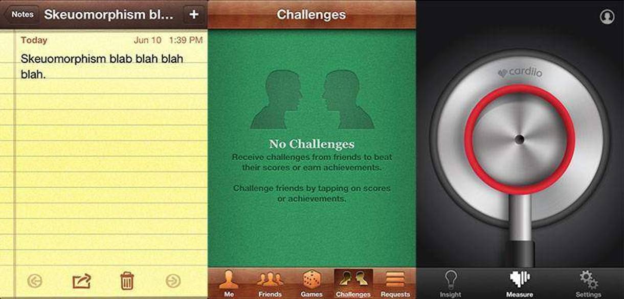
Apple has embraced Skeuomorphism early on and it can be clearly seen in their products. Their calendar clearly looks like a physical calendar and the notes resembles notebook paper, nothing revolutionary but it did present a realness that was rich and relatable.
What is Flat Design?
Flat Design - a minimalistic design approach that focuses on clean lines, bright colors and flat/two-dimensional illustration techniques. 2

Flat design can most recently be associated with the Windows 8 launch. Although, not a typical leader in the design community, Windows has embraced a user-focused design that incorporates flat design elements and is said to be a digital slap in the face to Skeuomorphic design.
The Transition to Flat Design
Flat design has been making an appearance for decades with roots in Swiss design3 but the overhaul of Windows has created a lot of debate in the design world. Designers are now questioning their approach and whether Skeuomorphic design is a hindrance or helpful to users.
Advantages
Skeuomorphism allows a graceful transition from old thinking to new and can also be visually enticing by using rich & familiar imagery. For instance, a music app will use knobs and buttons that can be seen on traditional music equipment.
Flat Design places emphasis on content and the user without relying on old methods. Flat Design also lends itself to responsive design techniques because it uses less textures/images and can be produced in the browser with newer design technologies.
Disadvantages
Skeuomorphism can often be seen as gaudy and tacky. It also can present confusion by featuring items that may not function exactly like their real life counterpart.
Flat Design could potentially confuse users. Color and contrast need to be carefully considered so that buttons/calls to action stand out next to other minimally styled elements.
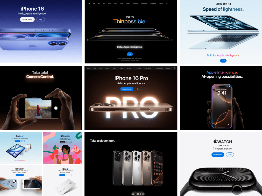
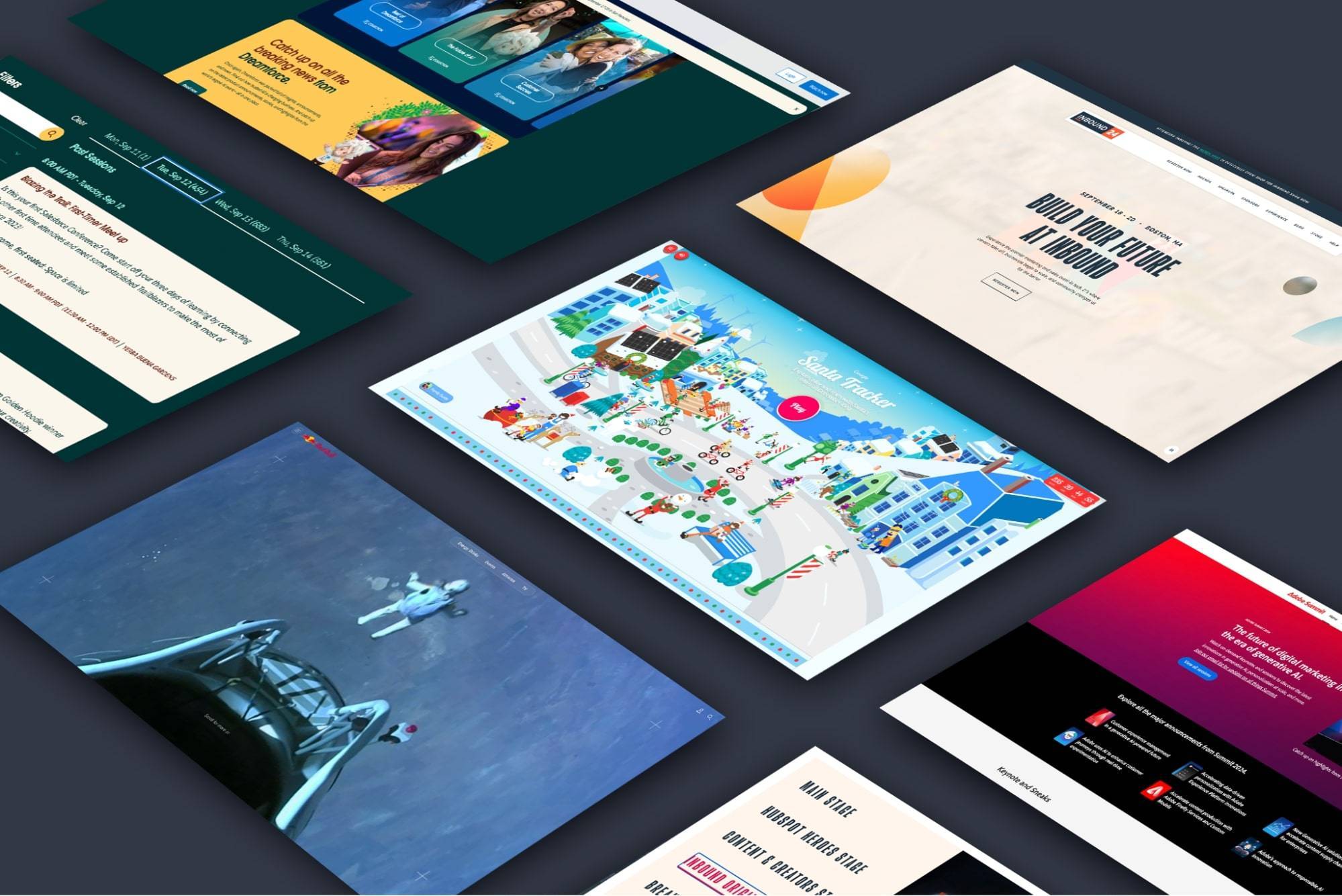
Examples of Flat Websites
Examples of Skeuomorphic Websites


