 < 1 Min Read
“We want a website designed like Apple’s.” We hear it in sales calls, strategy meetings, and design feedback.
And honestly, we get it– Apple’s site looks amazing and we love it as well.
https://www.dbswebsite.com/blog/how-to-design-a-website-like-apples/ But what makes it so good?
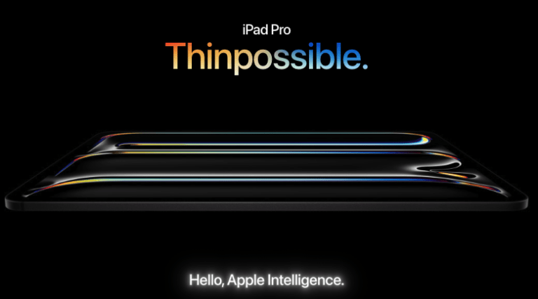
Apple’s website wasn’t always the polished masterpiece it is today.
It started as a basic page with simple navigation but has transformed into an intuitive, visually-driven experience that makes every product feel iconic.
That’s what keeps users engaged and coming back.
But in further discussion, we flesh out just why a client likes Apple’s website or why it is so good indeed.
It can be difficult to put your finger on what it is about Apple’s website that just “feels” right.
This article takes a look at what makes it appealing.
Core Principles of Apple’s Website Design
There's a reason Apple’s website feels effortless. Behind the scenes, every detail follows design principles that keep it beautiful, intuitive, and practical.
Minimalism and Clean Layouts
With a clean website layout, Apple removes distractions and keeps the focus on the content. Grids, white space, and a structured design create a high-end, professional feel that strengthens branding and engagement.
Contemporary Style
Apple’s website sets the bar for contemporary web design by keeping things simple. Clean lines, bold contrast, and smooth motion keep users engaged and encourage engagement to lower bounce rates.
Typography, Readability, and Accessibility
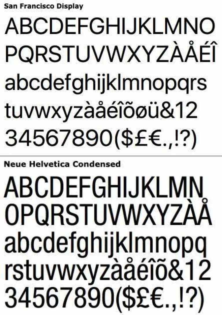
Apple distinguishes its website and all of its products with its custom-designed typeface, San Francisco. About 10 or so years ago the company replaced the Helvetica Neue font on its website, iPhones, operating systems, and other products with the San Francisco font.
The use of different font weights to create a clear visual flow makes it easy for users to navigate the web pages. Consistent color schemes are pleasing to the eye and simple to navigate.
Apple prioritizes accessibility with features like adjustable text size, contrast settings, and VoiceOver screen reader, ensuring a smooth experience.
For Apple’s website, typography isn't just about letters and words; it's a finely tuned art form where every choice serves a purpose, creating a distinctive and universally recognized brand identity.
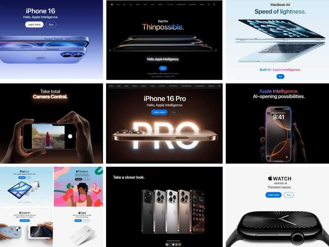
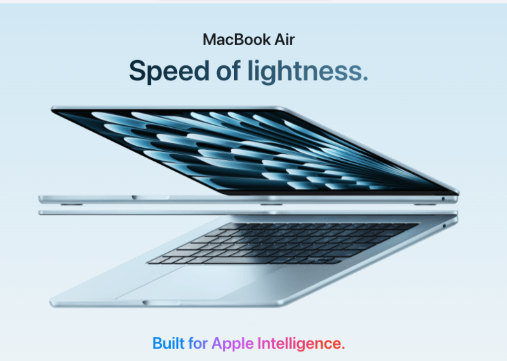
Product-Centric Approach
Apple’s website is designed to showcase its products.
- Brand and Design Consistency ensures a uniform experience across all pages, reinforcing credibility and trustworthiness.
- High-quality images and videos showcase products from every angle, making them more appealing.
- The use of white space directs attention to key features, keeping the design balanced.
- The intuitive UX ensures smooth navigation, making it easy for users to explore and purchase products.
Content and Information Structure
When visiting Apple’s website, the UX designers leave no stone unturned in guiding visitors who already have a goal–whether it’s finding product information or making a purchase.
“Good web design isn’t about cramming in content—it’s about delivering the right information at the right moment. Apple’s approach to user experience ensures visitors never feel lost or overwhelmed,” said Mark Shelton, COO at DBS Interactive, a Louisville-based digital agency.
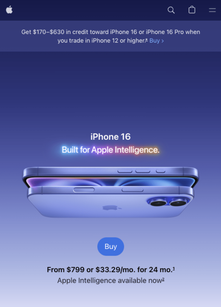
For example, if you’re looking for a new computer, the latest model is featured front and center with just two options listed. Learn More and Buy/Preorder. Instead of overwhelming users with text, Apple keeps information minimal until you click ‘Learn More’ for details.
Learn More Section
Apple provides in-depth product specifications, technical details, and featured breakdowns in a structured, digestible format. Vibrant pops of color draw the eye toward the most relevant information or upgrades to products.
Each product page includes descriptions, high-resolution images, and interactive elements to help users understand the device’s functionality.
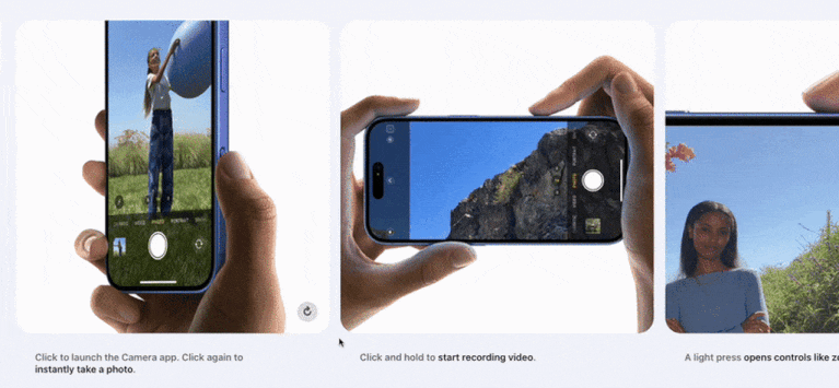
For example, the iPhone page breaks down camera capabilities with visual comparisons and animated demos, allowing users to see the differences in action.
Buying & Preorder Section
Apple makes purchasing simple with a straightforward product selection process, customization options, and streamlined checkout. Users can easily select storage, color, and carrier options with an engaging visual interface that updates selections in real time.
For example, the MacBook Pro order page allows users to select screen size, color, and chip type, making decision-making easier.
Comparison Pages
Apple helps users make informed decisions by presenting side-by-side product comparisons. These pages include specifications like battery life, display size, and processing power in a structured table format, allowing users to quickly see differences without leaving the page.
For example, The iPad comparison tool lets users toggle between different models, highlighting which features are exclusive to certain versions, making it easier for buyers to choose the right one for their needs.
Customer Support & Assistance
Apple ensures users can access help at any stage of their journey. From live chat to in-depth FAQs, the company provides multiple touchpoints for support, keeping the experience seamless and frustration-free.
For example, The AppleCare+ page offers a clear breakdown of service options, warranty details, and direct links to schedule repairs or speak with an expert.
Seamless Transitions
Apple’s pages are designed to naturally guide users from discovering a product to making a purchase. Engaging animations, well-placed CTAs, and smooth scrolling create an uninterrupted experience that keeps users engaged.
For example, when browsing AirPods, users can watch a product intro video, explore features with interactive demos, and seamlessly move to the checkout page—all without unnecessary page reloads or distractions.
Simple and Intuitive Navigation
Navigation is one of the most critical elements of Apple’s website. It’s designed to be easy, helping users find what they need quickly and without any hassle. Every design of Apple’s navigation system contributes to a smooth experience that keeps users engaged.
Menus That Make Sense
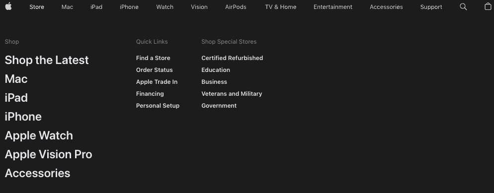
Apple's global navigation bar remains consistent across the site, with simple, easy-to-understand categories like Mac, iPad, iPhone, and Support. Hovering over a category triggers a mega-menu with a blurred background that focuses on the links.
Clear Calls-to-Action (CTAs)

Apple doesn’t clutter its pages with excessive buttons. Instead, CTAs are placed strategically and worded simply.
These CTAs use high-contrast colors and ample white space, making them easy to spot and encouraging users to take action.
For example, on the iPhone Learn More page, the “Buy” button is at the top, but as you scroll down, the header menu stays with you so you can make your decision to buy regardless of where you are on the page.
Visual Hierarchy and Structure
Apple prioritizes content through size, color, and typography, ensuring that the most important information remains noticeable.
Typeface design helps here with bold headlines, concise subtext, and well-spaced paragraphs guiding the eye naturally down the page.
For example, product pages use large headlines to introduce a feature, followed by smaller supporting text and images that reinforce the message.
Smooth Scrolling
Apple incorporates subtle animations and smooth transitions between sections, keeping users engaged while maintaining a polished, high-end feel. This approach prevents abrupt jumps between pages.
For example, as users scroll through the pages, different sections fade in, providing a sense of movement while presenting information in digestible pieces.
CMS & Technical Considerations
Apple’s website runs on a sophisticated Content Management System (CMS) and frontend technologies, ensuring high performance and scalability.
- Frontend Technologies: Apple prioritizes performance optimization. Behind the scenes, the site uses techniques, including lazy loading, which delays loading images, videos, and other content until needed, to enhance page speed and responsiveness.
- Accessibility & Mobile Responsiveness: A mobile-first approach ensures optimal usability across devices, helping businesses retain and convert mobile visitors.
A custom CMS is out of reach for most companies. There are off-the-shelf options.
CMS Recommendations
- Magento - Handles large product catalogs and online sales.
- Craft - Offers an integrated eCommerce component, making it possible to combine the ideal for content-driven sites with online sales with the addition of s that prioritize design flexibility.
Where to Start – How to Build an Apple-Like Website
Building a cool website inspired by Apple requires more than aesthetics. While it is always tempting to start with the design, following a plan with a solid strategy helps you achieve business objectives with your website.
- Goals & Audience – Define what the site should achieve, such as improving user experience and driving sales.
- Choosing the Right Platform & Tech – Pick a CMS and frontend stack that supports your needs.
- Clarity & Messaging – Keep the content clear and persuasive to support lead generation.
- Functionality & Usability – Ensure smooth navigation and interactivity to enhance engagement.
- Trust & Credibility – Use customer testimonials, case studies, and security features to build confidence.
- SEO & Content Strategy – Optimize for search engines, including AI search results, to attract organic traffic and increase conversions.
Why Apple’s Design Works for B2B
Apple’s design principles extend beyond consumer products. For B2B websites, an Apple-style approach strengthens brand messaging and enhances user experience.
“When a B2B website is intuitive and visually balanced, users don’t have to think—they just navigate, engage, and convert,” said Mr. Shelton
A clean, focused design helps build trust and guide potential clients through a seamless journey, increasing conversions and engagement.
Tips for Achieving a Minimalist Design
- Negative Space – Use ample white space to improve readability and draw attention to key elements.
- Design Balance – Ensure symmetry and consistency in layouts to maintain a professional appearance.
- Visual Breathing Room – Avoid clutter to keep users focused on the content that matters.
Remember: Design with a Purpose
It’s okay to take inspiration from Apple’s visually stunning and interactive website designs, but every website requires a unique strategy to effectively engage targeted audiences and meet the goals of a website project.
The most successful website for any business serves a company’s specific needs while incorporating intuitive, goal-oriented web design that focuses on its user’s needs.
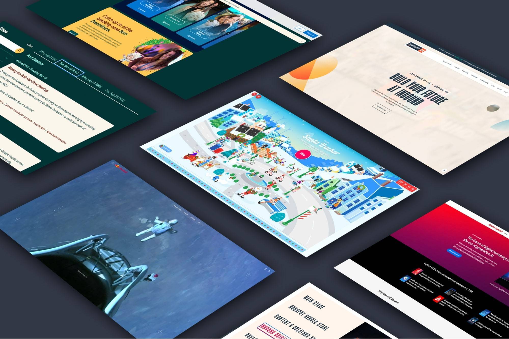
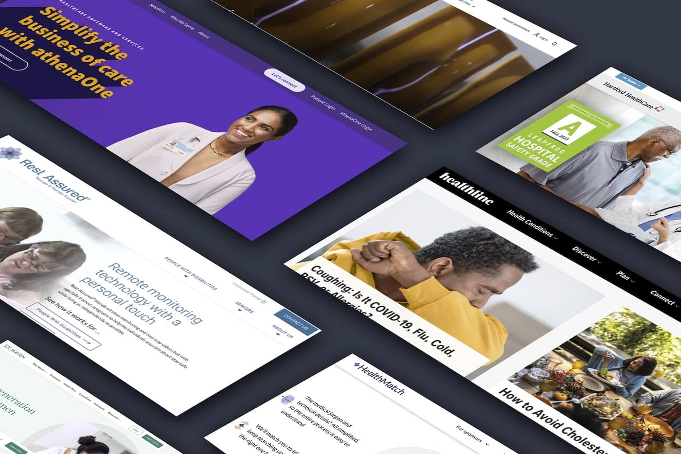
Other Apple-Like Websites
Apple’s website sets the standard for sleek and intuitive design, but it’s not the only site that follows that approach. Here are a few websites that we found and like that capture a similar minimalist look, product-focused, and highly polished aesthetic.
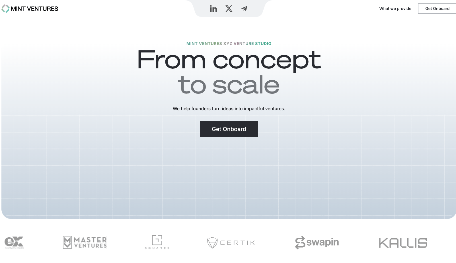
Mint Ventures. External Link. Opens in new window. applies a strict simple structure and uniform approach to images.
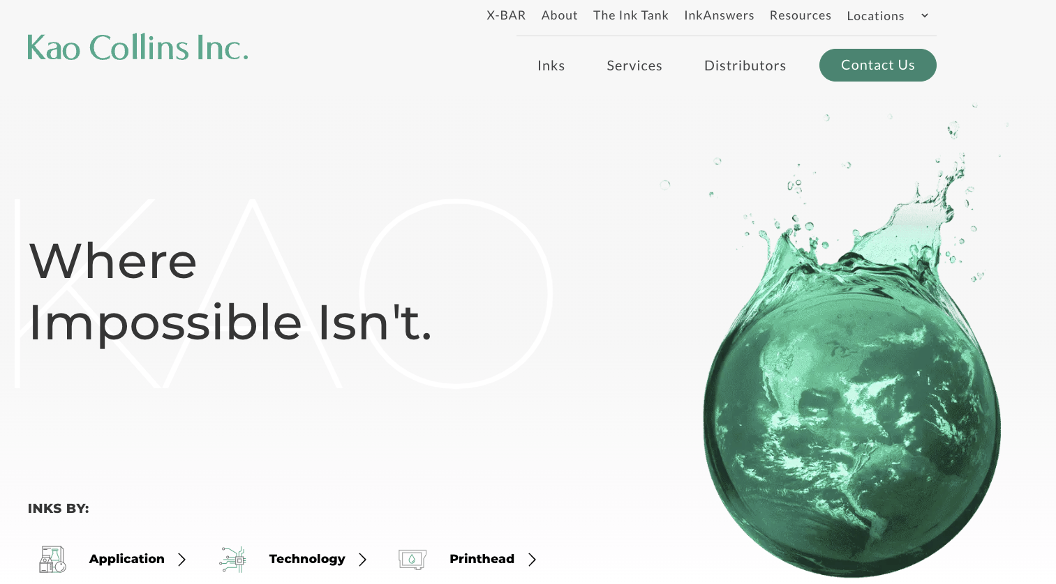
Kao Collins:. External Link. Opens in new window. White space, icons, and clear user pathways set the website apart from other chemical-related companies.
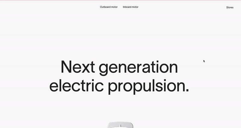
Propel.me. External Link. Opens in new window. uses visuals and interactive design to keep visitors engaged. It uses large content blocks and bold typography.

BSC Analytics:. External Link. Opens in new window. White space, type variations, and organized content deliver a superior user experience.
Bring Your Most Aspirational Web Designs to Life
At DBS, we have 20 years of experience designing and developing corporate websites with the same level of quality and performance you expect from Apple’s website.
FAQs
Clients often appreciate the following aspects of Apple's website design:
- Clear navigation with a well-defined information architecture and hierarchy.
- Simple and organized design using white or black backgrounds and negative space.
- High-quality imagery that faithfully represents Apple's products and services.
- Modern style with minimalist colors, fonts, and white space.
- Consistent branding and messaging throughout different pages and sections.
- The high traffic and popularity of Apple's website, elevated by the brand's global market dominance.
Apple achieves clear navigation through a top navigation bar that includes both links and icons, in addition to a drop-down mega menu that appears upon hovering over a main menu link. They use a sub-menu of icons on primary landing pages to display related products and services within each category, maintaining a straightforward layout that helps users intuitively know where to find the page(s) they're looking for.
Apple's website design relies on a simple and clean approach that makes it easier to consume its massive amount of content:
- No matter which page you're on, Apple's three-tier navigation structure helps users browse the site by broad categories or navigate straight to the sub-pages they want to see.
- On each page they use white or black backgrounds and negative space to focus the user's attention on distinct imagery or messaging, making the high amount of information more manageable and easier to consume.
- Apple avoids overwhelming users by not putting excessive content in any one layer (or "fold") of each page.
Apple's website reflects a modern style with minimalist colors, a clean san-serif font, and plenty of negative space. The style aligns with Apple's innovative and modern brand identity and market positioning, making it suitable for a leading global business that produces cutting-edge technology products.
Apple ensures brand and design alignment across its website by maintaining consistent typography, colors, imagery, messaging, and styles. While certain pages of the website may have unique layouts, the overall brand identity remains consistent when these elements are incorporated throughout the site.
Related Posts