Designing for Future Devices
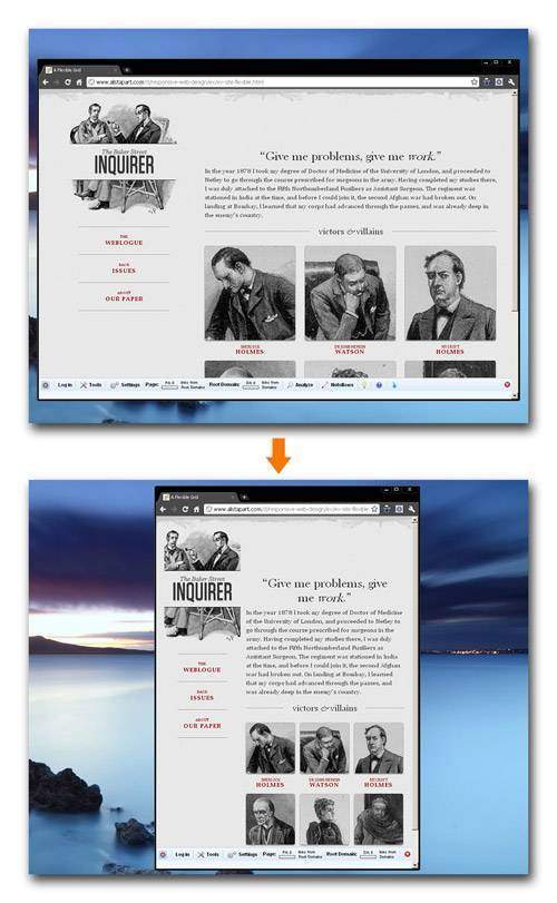
Flexible web design is a concept that has emerged in recent years that addresses many of the problems web designers encounter when designing for the seemingly endless range of devices, resolutions, and user preferences that individuals may use to view the web. Unlike print, where the layout is static, web design needs to be able to adapt to the object that is being viewed in – very much similar to how water effortlessly fills any shaped container that it is poured into. With alternate forms of web browsing becoming more predominant (mobile browsing is expected to exceed desktop based browsing in three to five years), the ability for your website to scale is of the utmost importance.

In the past, scaling techniques were either ignored for a fixed width, or accomplished through JavaScript. This JavaScript was used to detect the users’ resolution and accommodate the CSS through this detection. CSS 2.1 took the next big step in the right direction with the creation of media types. Media types offered web designers the ability to associate a style sheet to a specific device. Sadly, most browsers and devices never fully embraced the CSS specification.
As part of CSS3 specifications, W3C improved upon their previous specifications by creating media queries, which allow developers to not only target device classes, but to actually inspect the physical characteristics of the device rendering their work.
Flexible designs may very well be the way of the future, but are they appropriate for every situation? Not exactly. Let’s take a look at the pros/cons of flexible designs.
Strengths of a flexible design
The strength of a flexible design is its ability to adapt to the device that it is being viewed. New smart phones with differing resolutions are released on what seems like a daily basis. Tablets like the iPad and the new Blackberry PlayBook are becoming an increasingly popular option for browsing the web. Next generation consoles like the Playstation 3 and Xbox 360 come with their own browsers and many TV manufacturers have expanded the capabilities of their products to include Internet browsing. As the number of devices continues to grow, flexible web design will become ever more important.
In a flexible design, both images and text scale intelligently, which ensures that your design always looks in tip-top shape. Using the latest CSS3 specifications, designers can write a few lines of code that covers all devices. No longer do designers need code, which defines the CSS for each device and browser. In the long run, this means flexible designs are less labor intensive and ultimately cheaper to produce.
Weaknesses of a flexible design
Even though flexible designs ensure proper viewing of your design regardless of device, they do not altogether replace the need for a mobile-specific site. Images on flexible designs are scaled down to accommodate the smaller viewing screen. They do not however, decrease the image file size. Image heavy web designs that utilize a flexible grid may suffer from extreme loading times as the slower mobile network attempts to load the full size images.
Additionally, while flexible design can accommodate for most browser widths there are still extremes that designers should avoid. Allowing for the design to grow too wide or too tall can have adverse effects on the design. Paragraphs can turn into long blocks of text. White space can become overbearing. Images can become bulky. All of these factors need to be considered when planning the design.
And lastly, although all Webkit browsers such as Safari 3+, Chrome, Firefox 3.5+, and Opera 7+ support CSS3, Microsoft Explorer currently does not. Microsoft says IE9 will, but I’ll just wait until I see it with my own eyes.
Don’t yet understand how a flexible design works? Check these sites out. Try resizing your browser! Pretty cool, huh?
http://www.alistapart.com/d/responsive-web-design/ex/ex-site-flexible.html
http://natbat.net/


